(An ongoing writing project in which I catalog and quantify my extensive TARDIS collection. Find previous entries HERE.)
There have been loads and loads of Doctor Who Christmas ornaments on the market across the show’s nigh on 60 year existence. A number of them have even been TARDISes, of which I’ve detailed a couple that I already own here and here. However, I’m always up for another version of the TARDIS and this year has brought a fantastic one.
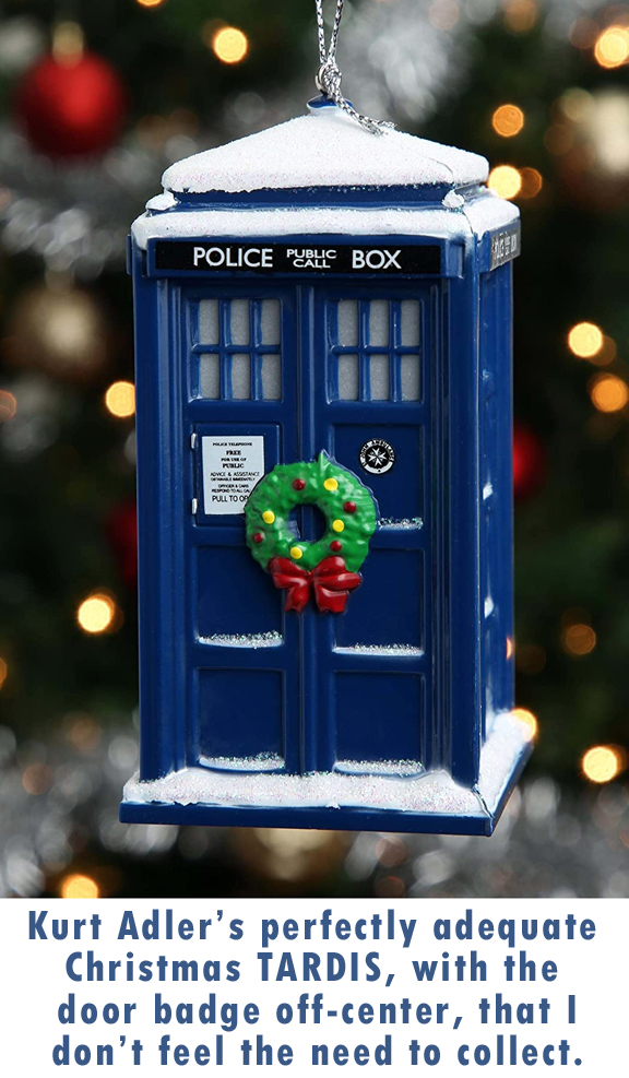 Let me talk first about a couple that I don’t own by a company that doesn’t always get their ornaments right. The Kurt Adler Company has made a number of Doctor Who ornaments few varieties, including the glass TARDIS ornament that I own and like quite a bit and the other plastic TARDIS ornament, which is okay. However, their more recent attempts just don’t appeal much to me. The Kurt Adler Doctor Who Tardis With Wreath Light-up Christmas Ornament, for instance, I don’t care about at all. It looks quite a bit like the plastic TARDIS ornament they released a few years ago, but with added snow sculpting to the exterior and roof. There’s also a wreath on the door and it lights up. However, the wreath’s positioning made it difficult for them to get the St. John’s Ambulance badge decal set into the center of its usual door panel, so they had to skew it toward the top. Design flaw. The phone door decal, at least in the pictures I’ve seen, is also a bit off square, which leads me to believe most of them must be. (I’ve seen other photos on different Amazon listings that seem closer to center, but quality control is not likely great. When the company releasing the product can’t be bothered to photograph a good one, why would I want it?)
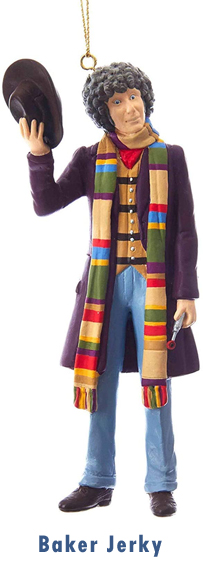 However, the real crime in the Kurt Adler Doctor Who ornament department is their Tom Baker figural ornament. I really REALLY wanted to like this ornament, because Baker is my favorite Doctor of all time. And I can see what they were going for with it, but it just… misses… all of the targets. I mean, look at him. He looks like a hippie. Sure, Tom’s Doctor was always very bohemian, which is a cousin of the hippie, but you never saw the man wearing blue jean bell bottoms. Maybe it’s just that they chose to paint his pants blue, a color he never wore in a trouser, but those cuffs are just unforgiveable. And the waistcoat he wears, while not dissimilar to ones he might have worn on the show, is in a pattern I don’t think is at all screen accurate, not to mention his kerchief is the wrong color. He’s also a lot skinnier than the man he’s modeled from, and the likeness is far from exact. His coat, while a similar color to his first season coat, is not the right cut to match it, but is also not long enough to match his latter day burgundy coat. And the scarf… The colors are a bit off, which I can forgive, but its length is about half of what it should be for a Baker style scarf. It’s like the sculptor was working from a verbal description of what Tom Baker looked like with no photo references at all. It’s like the Bizarro 4th Doctor. I’ve been tempted to buy it when I’ve seen it online, sometimes even very cheap, but I just cannot pull the trigger on such a janky Baker. (And, by the way, The Janky Bakers is the name of my Bread tribute band.)
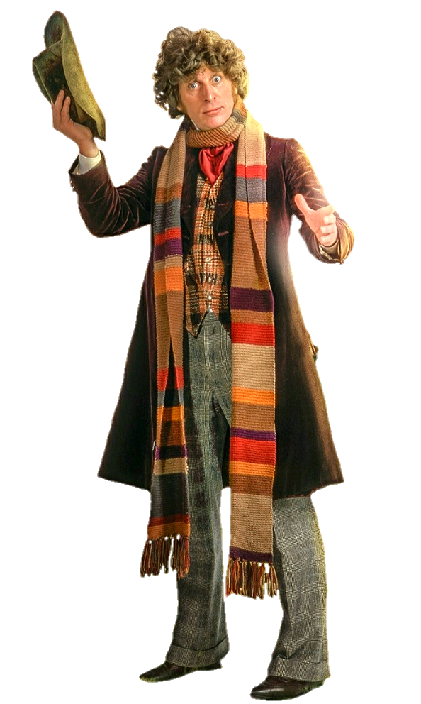 UPDATE 12-11-21: Okaaaaay. I have to issue a slight correction to the above paragraph here based on some new information I’ve found. While I still maintain the Janky Baker Kurt Adler Ornament above is still the Bizzaro Tom Baker, there’s a method to its madness I was unaware of. I would lay dollars to doughnuts that this ornament did use photo reference because I happened upon said photo reference. While looking for pictures of Tom Baker’s actual screen-worn scarf, I stumbled upon the image at right. It shows a veeeeery similar outfit and pose for Mr. Baker, clearly taken from an early season of the show. He’s not clad in bluejeans, but his cuffs are Super 70s ™ enough to appear to be bell bottoms. If anything, the ornament’s cuffs are more modest than the real pants. Coat color’s still wrong but is the right cut. The waistcoat isn’t too bad and has the same stripe pattern, albeit in a plaid instead of just the stripes. He has the same red tie and is holding his hat (also wrong color) in the same fashion. Scarf remains too short, but I suspect that the real baker probably had a loop of it hanging down his back. Or maybe they just had a stunt scarf for photo shoot days. The facial likeness is still off compared to the photo, but now that I see the photo they used, it’s not as far off as I’d thought. They capture elements of his expression, but the whole doesn’t reflect the likeness of the real guy. The hair sculpt doesn’t help. You can see what they were working from. I take back some of my ire at Kurt Adler’s work on this.
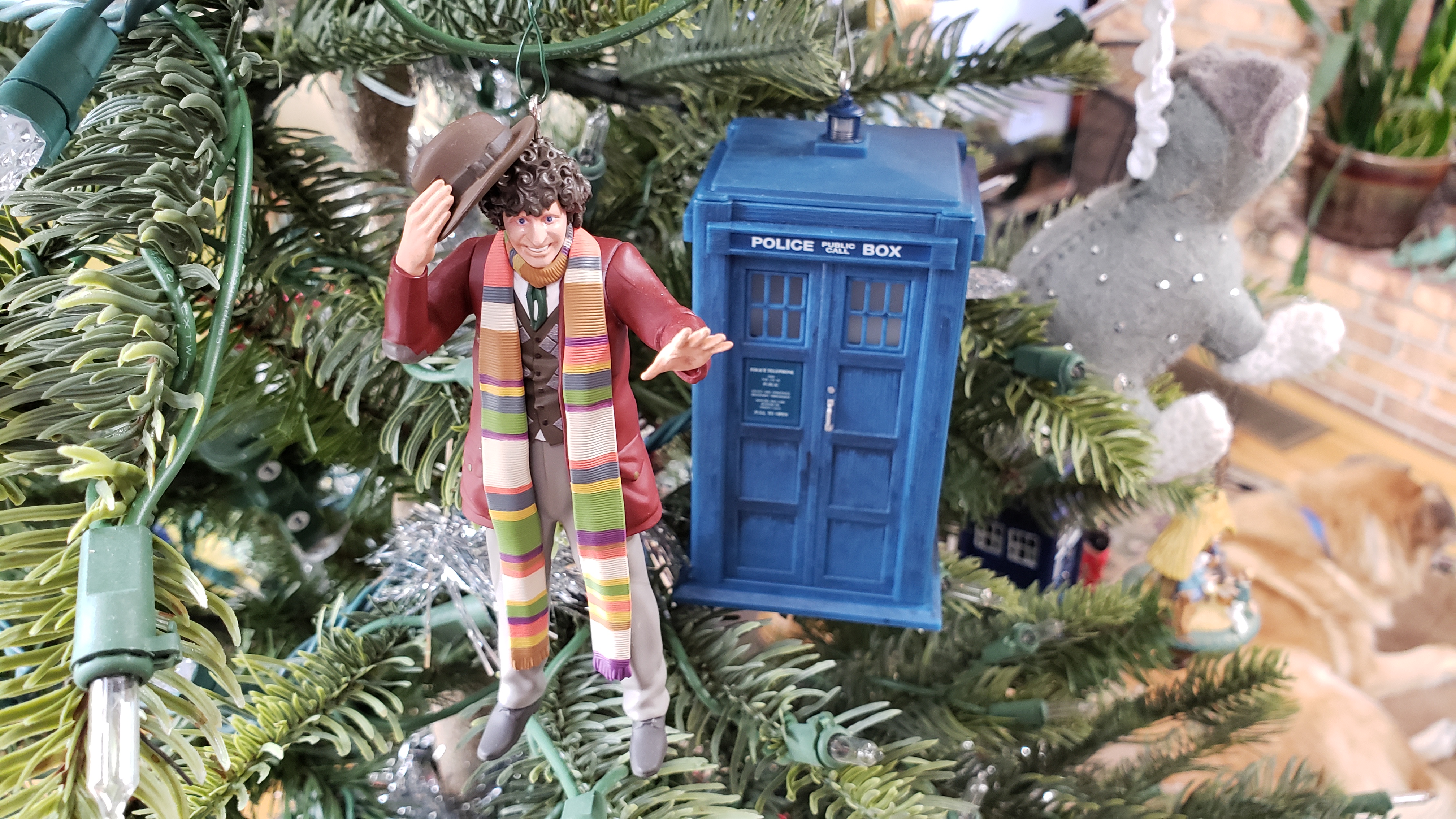
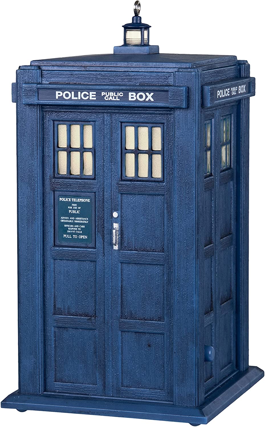 Let’s turn our attention away from Kurt Adler and to a company known world wide for their ornament quality. This year, Hallmark has added some Doctor Who items to their 2021 Keepsake Ornaments collection. One of these is a classic series TARDIS, which looks very much like it could have been from the Pertwee/Baker era. It’s a beauty, with the flat roof, the muted bluish green paintjob, the dark door sign, and everything. The sculpt is fantastic as well. And then, with the press of a button, the ornament lights up, both at the roof lamp and within, and alternately plays either the TARDIS materialization sound effect (nice) or the theme music from David Tennant’s run on the show (huhruhh?). Yeah, it’s kind of mystifying that Hallmark chose a more modern, though now 15 year-old theme, after clearly expending so much effort to get the
 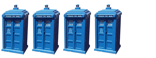 details of the piece so correct otherwise. I feel like I sort of have to knock a TARDi point off for this, which would otherwise be a five TARDi piece.
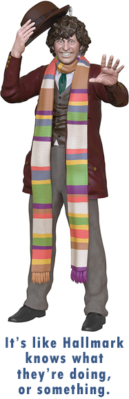 However, where Hallmark in no way dropped the ball for me is with their version of a Tom Baker ornament. If the Kurt Adler was the Bizzaro Universe Baker, this one’s the full on Superman. There he is, all curls and teeth like he looked in his first season, clad in his signature coat, vest, pants, and hat. It’s just like they sculpted it from a publicity still. In fact, I think they may have, though I have to say that the likeness in the face sculpt looks more like a Dave Gibbons drawing of a Tom Baker publicity photo than an exact match for Baker’s actual face. Which is probably an easier thing to sculpt. A small quibble I might have, which I’ve seen others complain of online, is the scarf. While longer than Kurt Adler’s, it’s still not to scale with the actual scarf from the show. At least not without another couple of loops around his neck. And the tassels for it are not accurate, as the original scarf had multi-colored tassels using the same yarn colors as in the scarf itself, whereas these are solid. (Even the Janky Baker got that part right.) I’m also told that the color order in the weave of the scarf is not screen-accurate, but I’m not going to quibble about that. It looks very similar to the scarf my mother-in-law knitted for me, nigh on 20 years ago, and I think they did a pretty good job on the ornament version.
They also look great on my tree.
Merry Christmas!